
STEPUP UX
PROJECT OVERVIEW
As part of my postgraduate course, over 12 weeks, we were put into groups and asked to design an origInal digital product to solve a challenge that the pandemic has forced us to face.
PROBLEM STATEMENT
During the pandemic, there were a lot of older people who were lonely and isolated due to the fact that we were in lockdown. The rise in technology and the fact that they did not use it had left them ostracised in a time of need for all.
RESEARCH
-

desk research
Corina and I (The Campaigners), undertook research into apps teaching you how to use the internet and online services. We then did some Competitor Analysis to compare and contrast the services available.
We found that there were only a few teaching apps available and only one that was very simple to use.
We then created a Survey/Questionnaire to find out how much they used the internet (if at all), what they felt about it and why?
Great idea, but the problem was that our user didn’t use the internet, so the surveys could not be completed online. The majority had to be completed in person at a church event.
-

Contextual inquiries
We decided that to get more accurate information interviews would be the best way forward. They could be more comfortable in their environment and hopefully would then give more honest answers. The idea being that the responses and body language would be more true to life as they are at home.
I carried out two of the interviews, which I recorded, so that we could go over the information at a later date when we compiled all the data that had been collected.
INSIGHT

KEY FINDINGS.
Users 70+ who did not use computers in their careers did not use online facilities.
Many users 80+ have never used a computer.
Remembering passwords was an issue.
Users were worried about online safety.
They did not have a lot of patience with technology.
They were willing to learn.
PERSONA
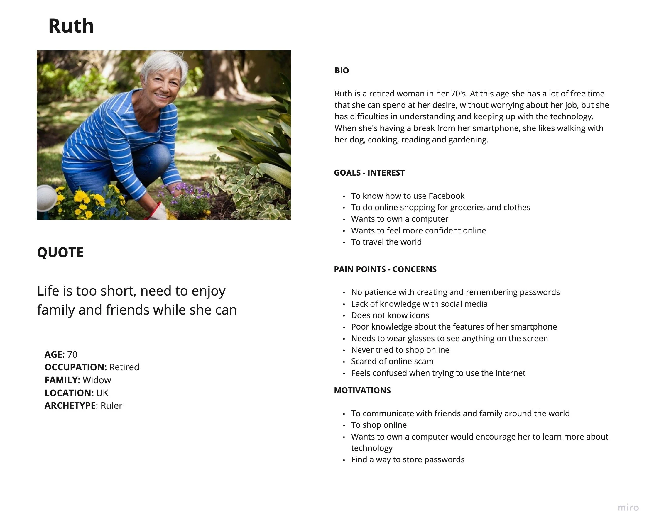
We created an affinity diagram using the results of the research. This information was then considered and that then enabled us to create our Persona. The persona is the person who we have in mind when we are creating the app to help view the user from a human perspective.
With Ruth as the Persona, we created Scenarios, Empathy Maps, Use Cases and Journey Maps to see how Ruth would behave, feel and cope in each situation. This gave an indication of what we would need to put into the app to make it a successful and viable product.
VALUE PROPOSITION STATEMENT
We propose to make an App that will teach people who are not comfortable using the internet to be able to use the internet confidently and safely. It needs to be simple to use, with all accessibility needs catered for. They will have the options of reading the information, watching videos and/or speaking and listening to it.
There will be information when you enter the app that explains how to use it and what the icons on the app mean. This will always be available if they need a refresher.
It will let them know when they have completed each section and they will “Step Up” as an indicator of what they have achieved.
This will then be recorded, so the next time they go on the app they can check what they have completed and try the next thing.
INFORMATION ARCHITECTURE

This is the basic Information Architecture for the Step Up App. A diagram showing you where each
page will lead to.
The User will have the choice to either read the information, watch videos or interact using AI technology.
TESTING
I tested the prototype and found that my participant was just pressing the buttons, but did not understand what they were for. I think she was just pressing them to see what would happen.
The concept of it being a prototype didn’t really make sense to her. I realised that for this type of user group the prototype had to be high fidelity (with images/videos and copy) as then they could not really grasp the concept that it was a mock-up and didn’t do what the final App would. Just because I understood what it was meant to do and/or represent, didn’t mean that they would.
The user would press an icon to see what happens, not because they know what it does, but because it is there. The pressing of random icons is not necessarily a bad thing because then they would learn from the icons they have already pressed (hopefully).
PROTOTYPE

SUMMARY
I found out that the test participant did not have an email, which should have been obvious. This teaches me that in the next iteration, the login and sign in pages should be changed to enable the user to be identified in another way. Maybe they could be identified by their phone number or biometric data, which could also record their progress when they next go on the App. This would also be removing another screen and the stress of remembering a password and thereby simplifying the process a little more. The process needs to be self-explanatory to any and everyone.
The backgrounds of these particular users are totally different to what we have come to expect, as generations now grow up with technology and too many of the users this is a totally different language that no one has taken the time to teach them.
This shows how the design process is not linear, you may need to go back and re-think your design after testing to find a solution that will work better for your users.